What makes a brand feel right?
What makes your perfect customer stop, think and feel that what you stand for makes sense for them?
Not just polished. Not just attractive. But coherent. Meaningful. Intentional. Aligned. Like every part of your brand belongs.
This is what we’re here to help you with.
At Theodore, we know the strongest brands are built from the inside out. Strategy comes first. Always. Brand visuals without clear meaning are just random decorations. And random decorations can be a very expensive way to fritter away marketing budgets. As brand strategist and author, Marty Neumeier, puts it:
Design is not decoration. It is the delivery system for strategy.
So, brand visual identity is the execution of your brand strategy made visible. Great brand visuals are what happens when thinking, positioning, behaviour, and purpose are translated into something people can instantly recognise and feel. That understanding sits at the heart of how Theodore has evolved as a brand.
We wanted our brand to communicate what it’s like to work with us. It’s what we do for others, so we couldn’t wait to do it for ourselves.
Pete Boydell
Lead Brand Strategist, Theodore
Understanding the evolution of the Theodore brand
When we first started out at Theodore, our visual identity was louder. Brighter. Intentionally difficult to ignore. Partly because nobody else was using those colours, and that way we could stay distinct from the brands we worked with.
But over time, the Theodore brand matured. We knew our visual identity needed to better reflect the way we actually work – thoughtful, exploratory, curious, collaborative, and strategically grounded.
Northern explorers with compassionate souls
We ask the most questions during the strategic process. Why? Because we believe that our curiosity fuels the process – to get to a better solution for you. We’re explorers at heart and so that’s the brand archetype we embody. On top of that, our tone is northern, curious and caring. So, we have embraced these ideas and shifted how our brand speaks, looks and feels.
Let’s take a look at the different elements that come together to communicate these ideas.
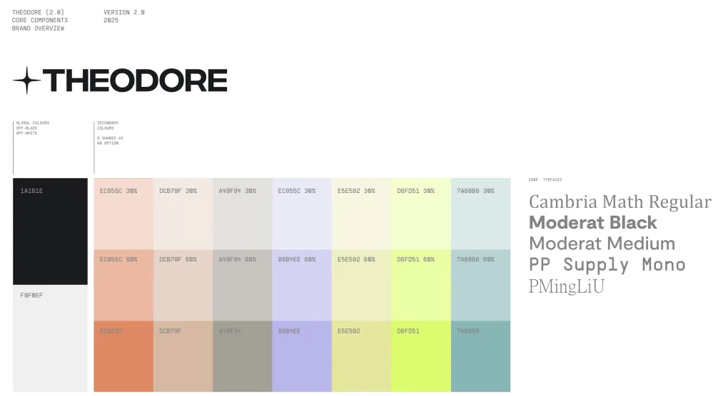
Today, the Theodore brand draws from more grounded, natural tones
Why? Our refreshed brand colours are inspired less by noise and more by a more mature style of navigation. Our teal, purple, grey and warm orange each play a role within the palette, while vibrant yellow is reserved for moments that need direction and action. Nothing exists simply to “look nice”. Every colour has meaning and every colour has a job to do.
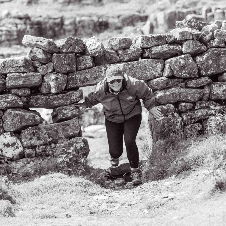
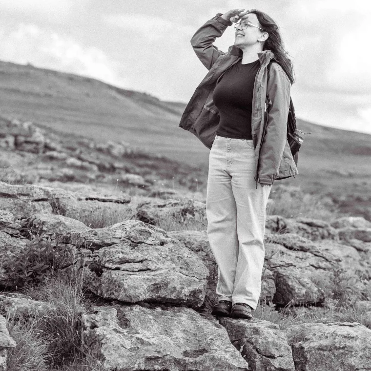
A walk up Ingleborough
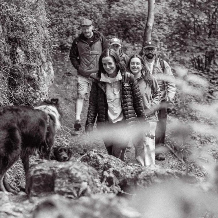
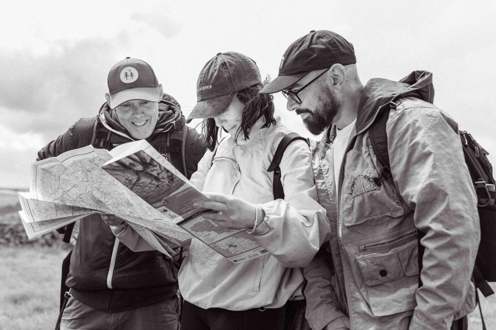
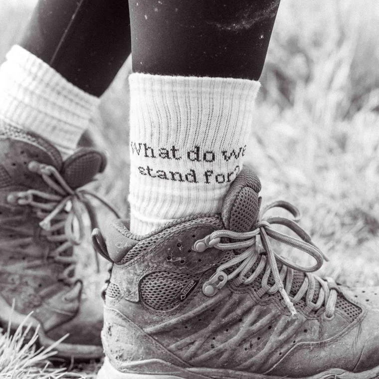
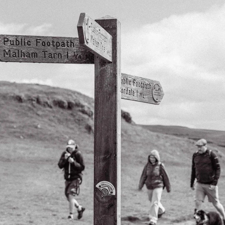
We investigated a few different paths for what photography might best express our brand. In the end we settled on a team hike up one of the Three Peaks. We believe nothing feels more personal, genuine, northern, and truly representative of our team and our exploratory nature. Plus, it was a great laugh.



Directional arrows are exploratory graphical devices
They help guide people through information and experiences because exploration is central to who we are. We believe brand strategy should create movement, clarity and momentum.




The geometric patterns represent your shared journey
Up close, the pattern can appear fragmented and complex. But when viewed as a whole, it creates cohesion. That’s intentional. The geometric pattern is contemporary and familiar (you can see it in modern furniture and tiling) but for us it reflects the strategic process itself: bringing together different perspectives, moving parts, questions and ideas into a single aligned path.
Exploring with map contours
Strategy journeys are rarely linear. Businesses encounter obstacles, shifts in terrain, and unexpected turns. Our role is to help our partners to navigate those complexities with clarity and confidence. The visual language of contours and maps reflects that journey of exploration we take together with our clients.
Your North Star
Brand explorers need a fixed point to aim for. A sense of direction. Something to guide decisions and keep momentum moving forward. That’s ultimately what branding is. Not surface-level styling. Not trends. Not decoration. A good brand helps people understand where they’re going, why they matter, and how everything connects along the way.

So, what makes a brand feel right?
What makes your perfect customer stop, think and feel that your brand makes sense?
One of our values as a business is teaming up with the right people. So, it’s important that our brand looks and feels just like us from the off. We hope that you love the evolution as much as we do.


Because when we take this journey of exploration together, we can both learn new things, push new boundaries and reach new goals.
Contact
Let’s journey together
Reach out and we can talk about getting your brand shipshape, tip-top and big-vision-ready.