
Spotted out in the wild: brands are stripping things back. Way back.
Less copy. Fewer colours. Bigger products. Sometimes, no logo at all. And strangely, the less they’re showing us, the easier some of them are to recognise. One campaign in particular got us thinking.
The McMuffin that didn’t need a logo
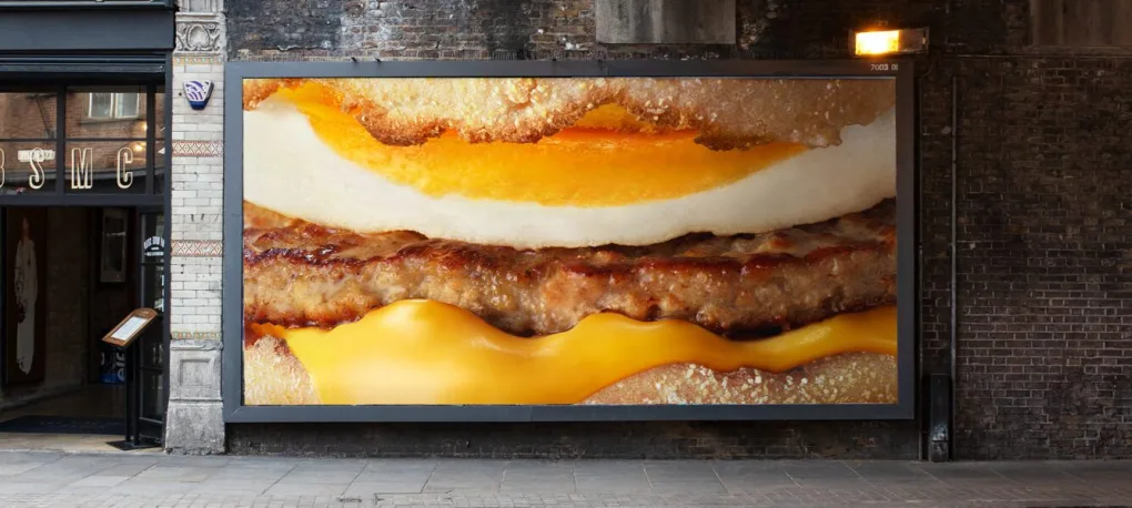
You’ll have probably seen THE McDonald’s breakfast campaign. A close-up of a McMuffin. The sausage. The egg. The cheese. No big golden arches. No I’m Lovin’ It. No explanation at all. It doesn’t need it. You know it’s McDonald’s.
The campaign, created by Leo Burnett, was based on research that found up to 90% recognition of McDonald’s breakfast products without any branding. And we’ve started seeing this confidence more and more recently.
The confidence to strip things back
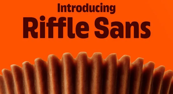
Reese’s has gone all-in on the cup. Not just as a product, but as a brand asset in its own right. Its distinctive ridged shape now influences everything from typography to packaging and communications.
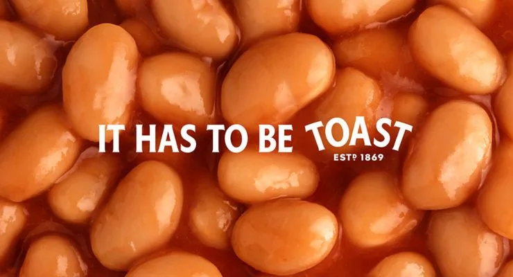
Then there’s Heinz. Their ‘Trigger the Taste’ campaign relied solely on macro photography of their iconic products to turn out of home ads into sensory icons, with a clever twist on it’s famous tagline, replaced with the food that completes the pairing.
Different brands. Different agencies. Different executions. But the same idea seems to be bubbling away underneath.
How little can we show you and still be unmistakably us?
This isn’t really about minimalism
It’s tempting to look at this work and think there’s a new minimalist design trend happening. There probably is. But that’s not what makes these campaigns work. They work because these brands have spent years building recognition.
Mark Ritson talks about brands having a palette of brand codes. Byron Sharp calls them distinctive brand assets. Whatever you label them, the idea is simple – a selection of assets – colours, shapes, characters, sounds, type, language, even behaviours – used consistently, are non-negotiables in branding.
Think about McDonald’s. The golden arches are one code. But so is red and yellow. I’m Lovin’ It. Even the ba-da-ba-ba-ba. McDonald’s doesn’t have one distinctive asset. It has a whole palette to play with.
Simplicity has to be earned
That’s perhaps the bit that’s easiest to miss. These campaigns look incredibly simple, but simple isn’t the same as easy. McDonald’s can put a massive close-up of a McMuffin on a billboard because we’ve seen McDonald’s thousands of times before. The recognition has already been built. For the rest of us, the lesson isn’t to make your logo smaller or put one massive product on a billboard. It’s to ask a much more fundamental question:
What does your brand actually own?
- What colour could only be yours?
- What shape?
- What style of photography?
- What words or phrases?
- What graphic devices?
- What product features?
- What behaviours?
- What could someone see, hear or read and instinctively think of you?
That’s where distinctive brand assets get interesting.
The temptation to keep changing
There’s a problem. Marketers get bored. We’re close to our brands every day. We see the same colours. The same typeface. The same messages. The same layouts. So we want something new – a new campaign needs a new look. The website needs refreshing. We’ve used that line before.
But your audience isn’t paying anywhere near as much attention to your brand as you are. What feels repetitive to you might only just be becoming recognisable to them. Distinctiveness is built through repetition. Not mindless repetition. Consistent, creative repetition. Knowing which parts of your brand are sacred and then finding new and interesting ways to play with them.
Start with strategy
This is why we don’t see distinctive brand assets as something that belongs purely in the design stage. They start much earlier. With the strategy.
- What do you want to be known for?
- What territory are you trying to own?
- What should people feel when they encounter you?
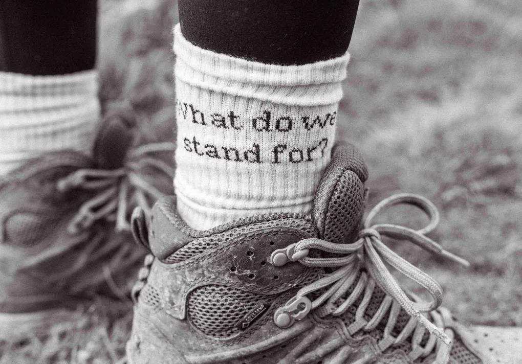
- What’s the red thread that needs to run through everything?
Once that’s clear, your identity can start giving those ideas a recognisable form. And then comes the really important bit. Then you keep using them. Again. And again. And again. Until one day, perhaps, you can take the logo off.
So here’s one to take back to your own brand: Cover up your logo.
What’s left? And does it still look unmistakably like you?
Up next...

Contact
Let’s journey together
Reach out and we can talk about getting your brand shipshape, tip-top and big-vision-ready.